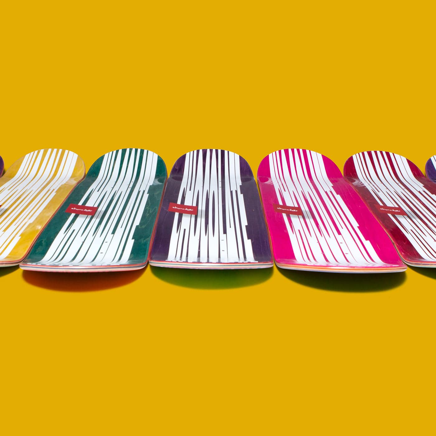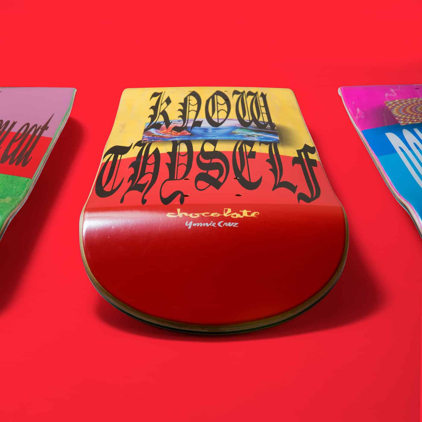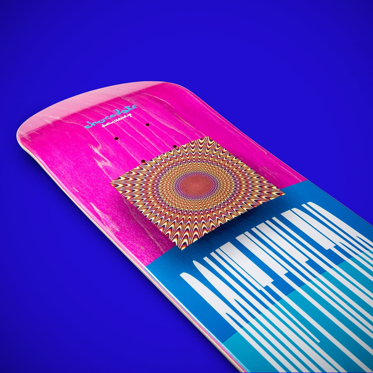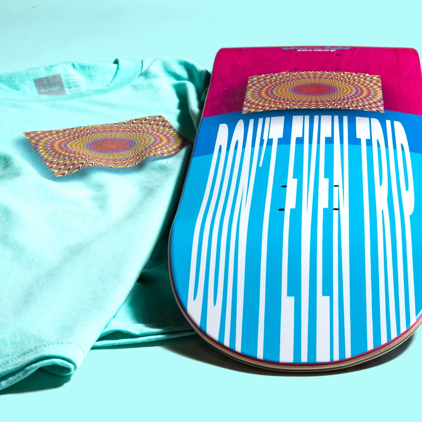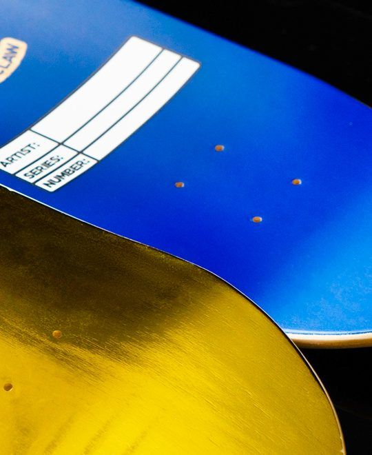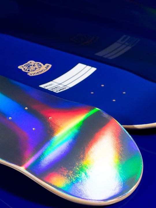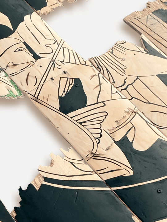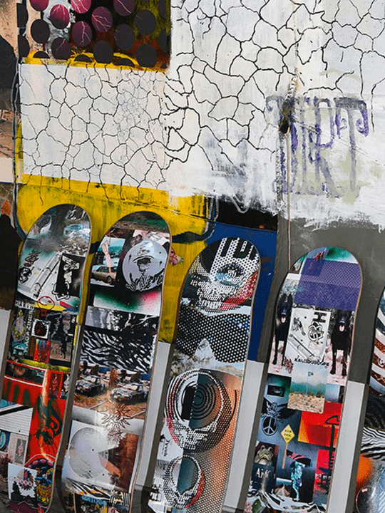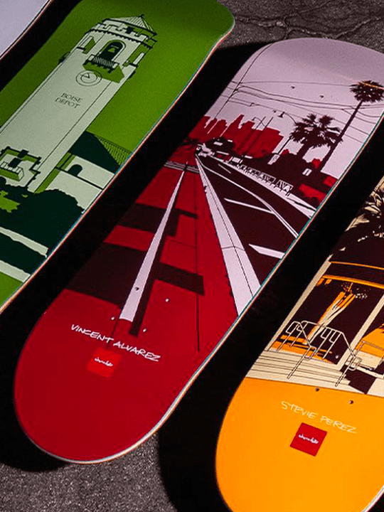
The designer Eric Gorvin realized for Chocolate this very graphic and fun series entitled ‘Don’t trip’. The concept is to be on a typographic game that completely distorts the readability of the text. To read it in the most classic form of the font, you have to look at the board from a certain angle (see the video at the end of the article). The messages to them are positive and full of wisdom.
The series is available on the Crailstore website.
